Fall Color Palettes for Small Business Branding
Choosing the right color palette for your brand is one of the most powerful ways to stand out online. Your colors set the tone for how customers feel when they land on your website, scroll through your Instagram, or pick up your business card.
As we head into autumn, many business owners look for ways to refresh their branding with warmer tones. That’s why I’ve pulled together three fall-inspired color palettes that not only capture the cozy, seasonal vibe but also work beautifully all year long.
If you’re a wellness brand, fitness studio, spa, nutritionist, or creative business, these palettes will give you the perfect balance of warmth, professionalism, and versatility.
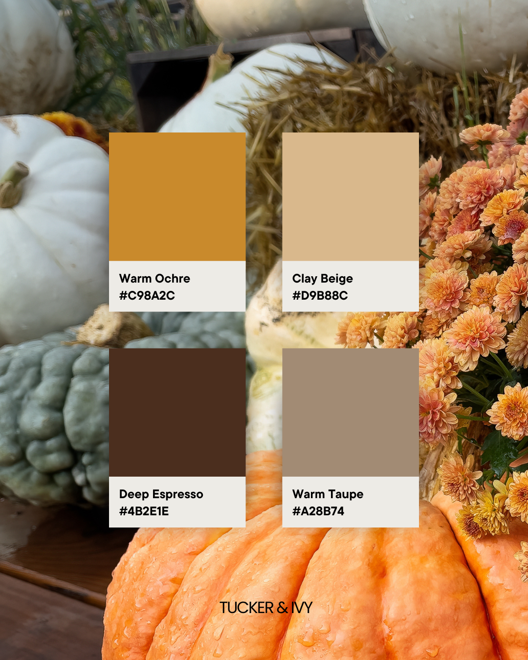
Palette 1: Golden Neutrals
Colors: Warm Ochre | Clay Beige | Deep Espresso | Warm Taupe
This palette is all about grounding, trust, and timelessness. The warm neutrals pair well with both bold imagery and minimalist design, making it flexible across platforms.
Best for: wellness studios, yoga teachers, holistic coaches, or service-based businesses that want to feel approachable and steady.
Why it works: Golden neutrals are calming and classic, helping you connect with your audience in an authentic way.
Palette 2: Rustic Elegance
Colors: Burnt Sienna | Olive Grove | Dusty Rosewood | Golden Wheat
This palette blends earthy and elevated tones — a nod to creativity, craft, and natural beauty.
Best for: boutique fitness brands, nutrition businesses, creative service providers, or artisanal shops.
Why it works: It’s rooted in nature yet feels polished, making your brand memorable without being trendy.

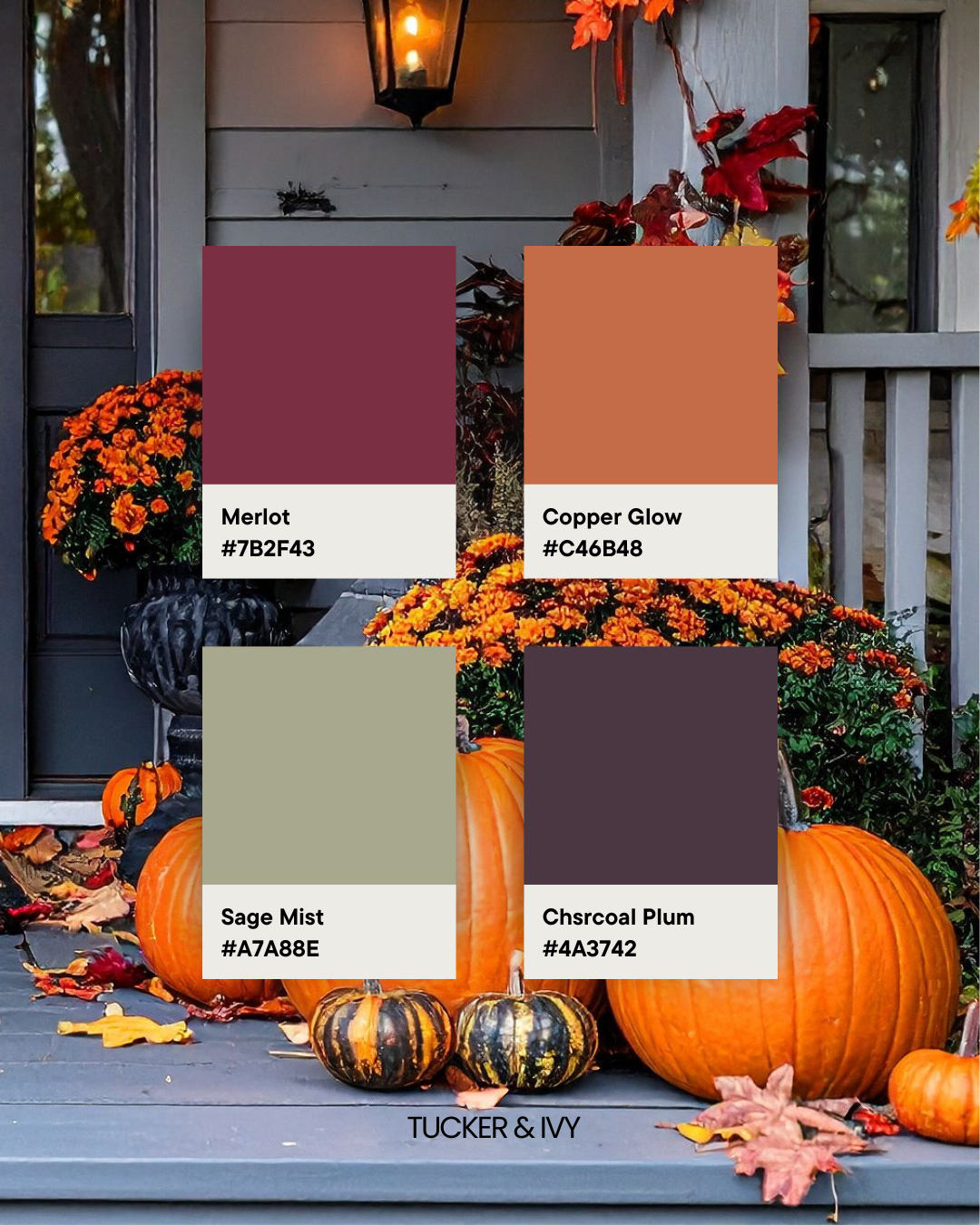
Palette 3: Modern Autumn
Colors: Merlot | Copper Glow | Sage Mist | Charcoal Plum
This bold palette delivers sophistication with depth. It’s modern but still warm enough to feel inviting.
Best for: skincare and wellness brands, boutique gyms, modern cafés, or personal brands wanting a confident edge.
Why it works: Rich jewel tones signal confidence and professionalism while staying approachable.
How to Use These Color Palettes
When building your brand identity, website design, or social media templates, your color palette should be consistent across all platforms. These palettes pair seamlessly with black and white for balance, making them versatile throughout every season — not just fall.
If your brand feels a little stale, refreshing your color palette is a simple but powerful way to give your marketing a polished, professional look. Use these palettes as inspiration for your next website update, Instagram carousel, or seasonal campaign.
Need help creating your website, or branding your emails? Schedule a free call - Tucker and Ivy can help!
Liked this post? Share it on Pinterest!